Intro
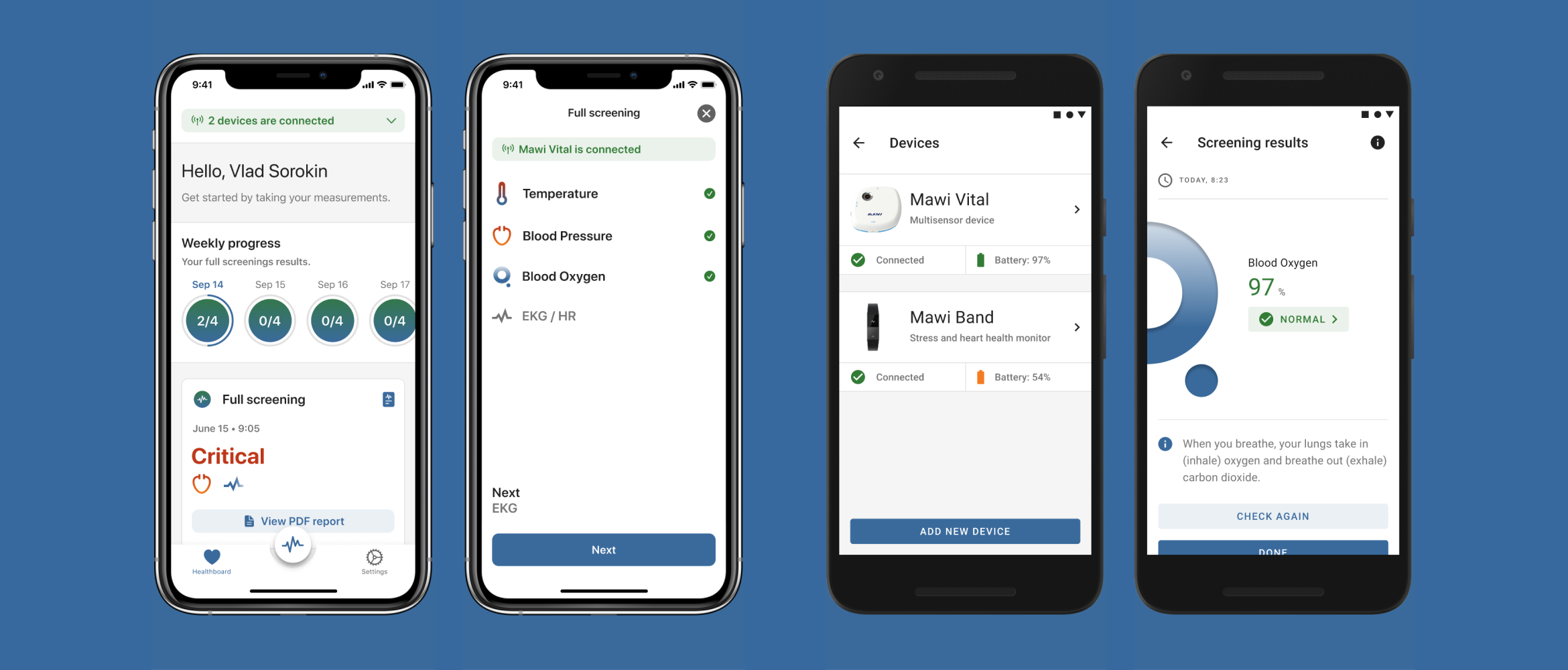
Mawi Vital device is designed to provide an ability to scan essential health signs, such as temperature, blood pressure, blood saturation, EKG, heart rate, and blood glucose. The device connects to a Mawi Vital app that stores all scan data which can be shared with doctors or family members.
Challenge
Design a dashboard of the mobile app that people could use easily for taking a desired scan, check history of scans, and share instantly health results.
Constraints
- The app needed to be shipped quickly, so there were no time and resources for initial research phase
- We aimed to ship the product for b2c as well as for b2b clients, so there were predefined requirements from the business perspective on some level
Team
- Founders
- CTO
- iOS developer
- Android developer
- Product designer — me ?
- QA
- Illustrator
- Data scientists
My role
As a sole designer in the team, I was responsible for:
- Leading design of a Mawi Vital app from scratch for Android and iOS platforms
- Providing QA and eng design specs
- Conducting usability testing
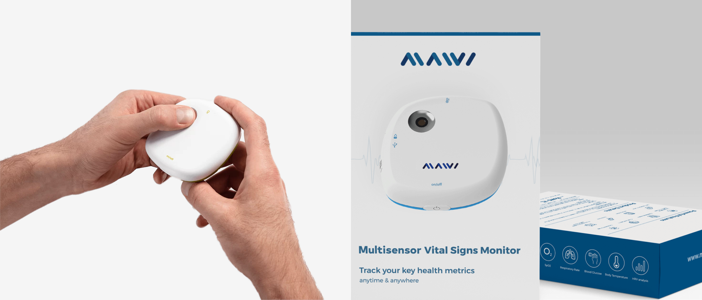
Mawi Vital device
Dashboard aka Healthboard
One of the main screens in the app was a dashboard (we called it a Healthboard). The Healthboard’s mission was to provide all important data and functionality to users right there, so they could take a desired scan.
User scenarios of using the healthboard:
Since a custom task schedule was a new feature to be implemented to the already predefined schedule option, I used a Hierarchial Task Analysis that could help me to generate ideas of the steps that a user must take in order to complete a goal.
My process of a Hierarchial Task Analysis was broken down into the following steps:
- People would regularly track their health symptoms, and if something comes up as irregular health signs, they could report them to a doctor remotely through the healthboard
- People could track health symptoms of their loved ones. Elderly parents take measurements, so their children could remotely keep track of the health results
Pre-defined attributes by our hardware engineers + device capabilities:
- Full screening result (a scan with all six scans combined)
- Full screening PDF result
- Last screening date and time
- Data of the last scan
- “Check now” button
- History of all previous scans
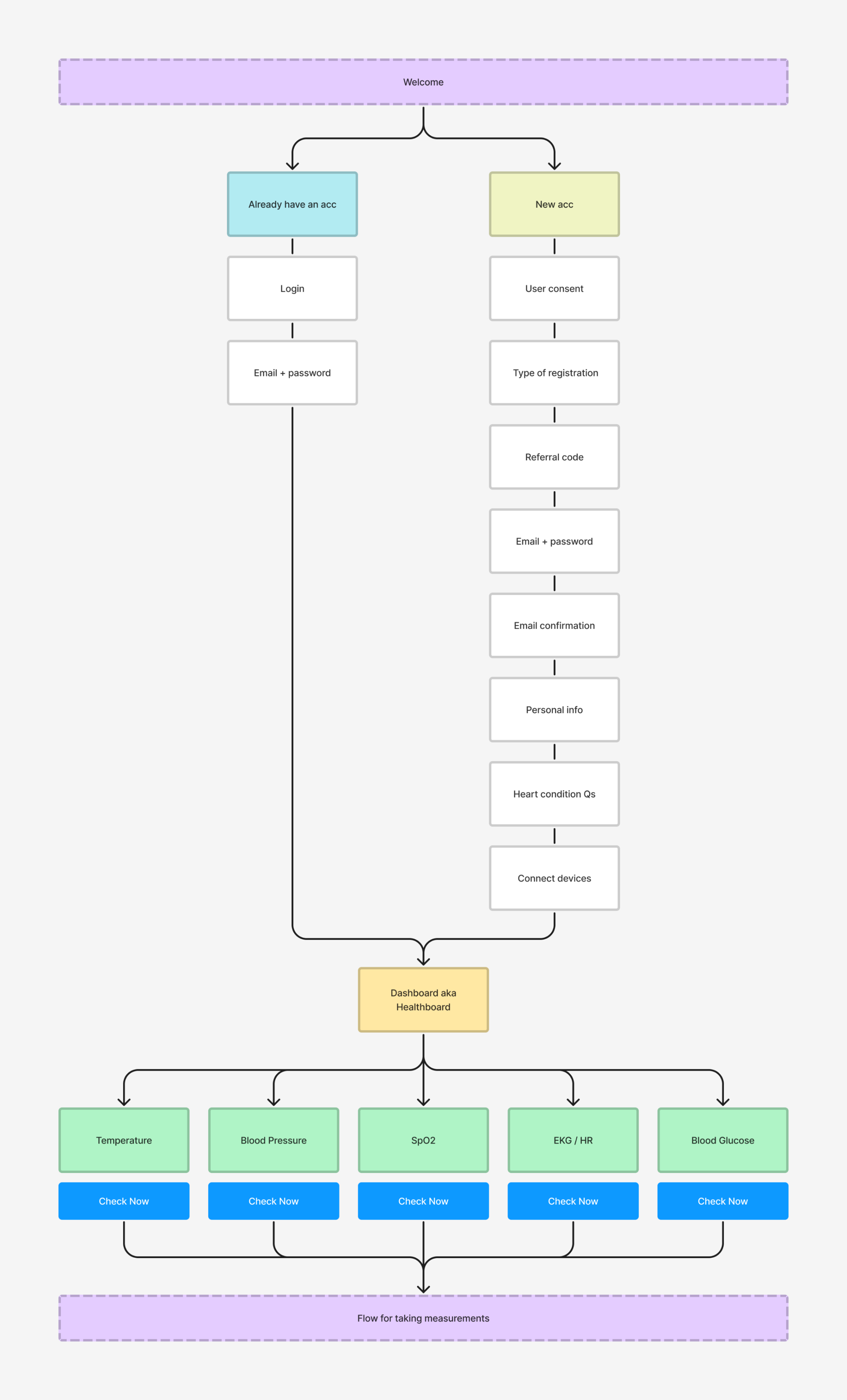
Healthboard's flowchart
Healthboard. Initial version.
Based on the Mawi device physical capabilities, I came up with two lo-fi variations of how we could arrange key attributes in the app. The option A worked for the team because:
- A vertical alignment provides more visible content than a horizontal one
- It will be easy to see critical data on the measurement cards
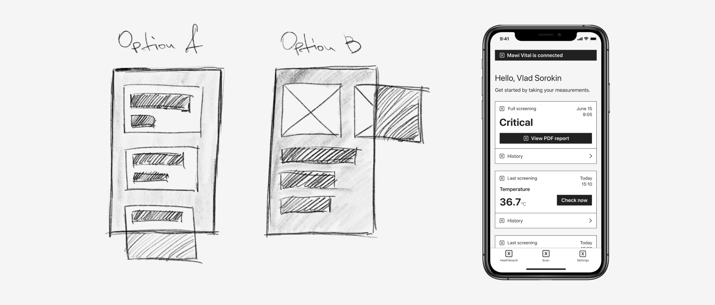
Lo-fi + wireframe
Once we agreed on the key attributes, the lo-fi and wireframe options, I prepared an initial hi-fi mock.
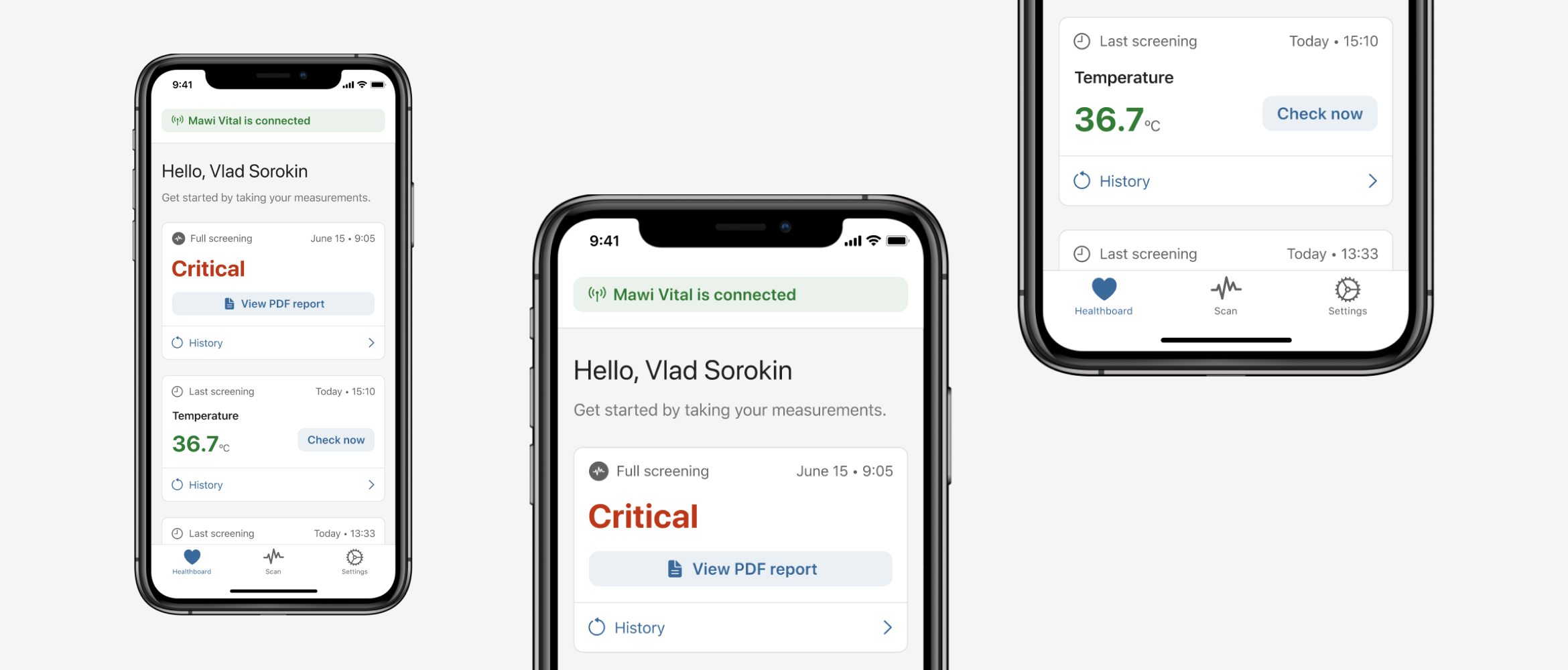
Initial hi-fi version of the Healthboard
Healthboard. First iteration.
In order to see easily a specific measurement and its data, I added visual anchoring to reduce the cognitive load, so eyes could “catch” visually a desired measurement.
Five custom icons were designed for measurements, which could be used anywhere on different media.

Custom icons for each scan
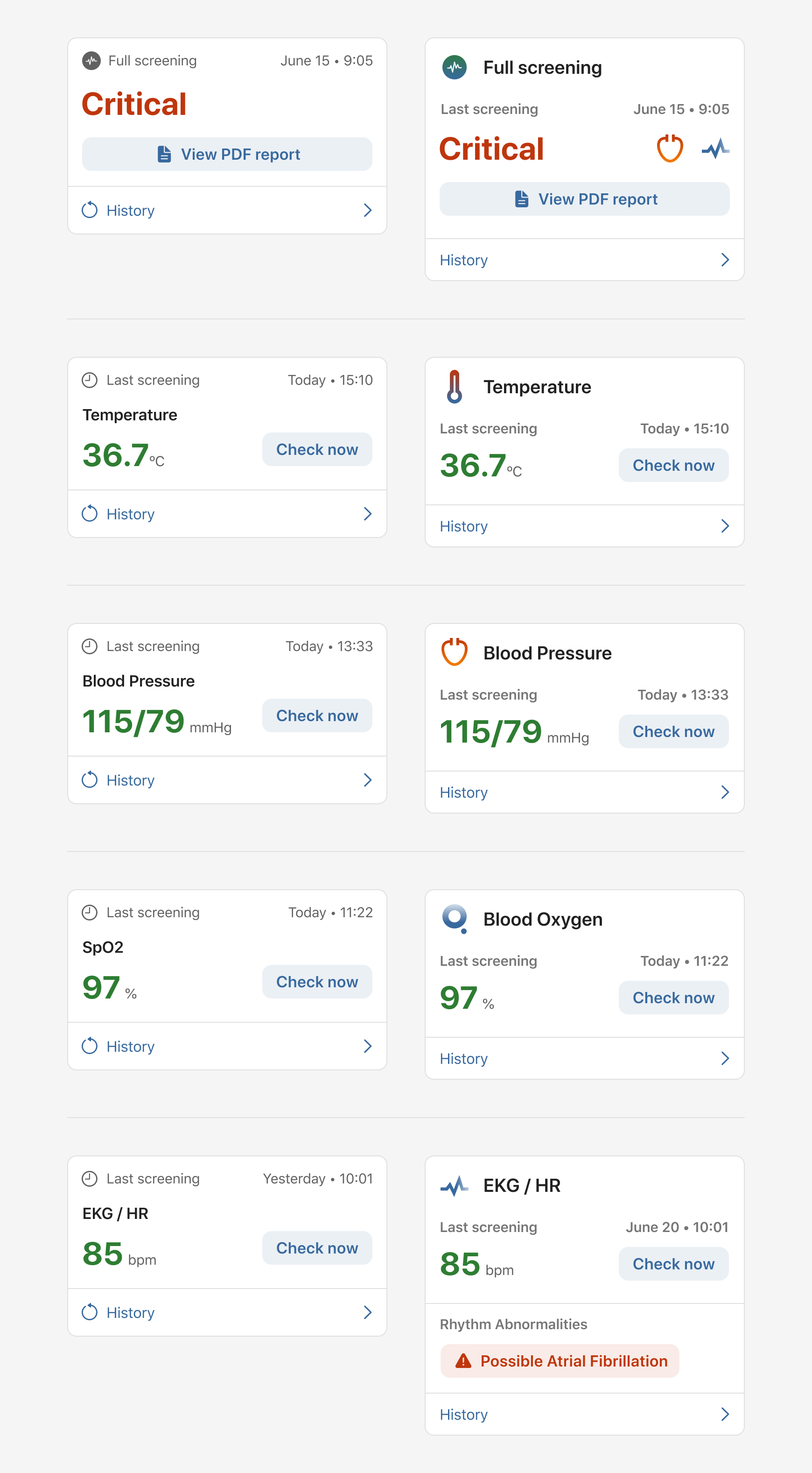
Health cards. First iteration. Before and after.
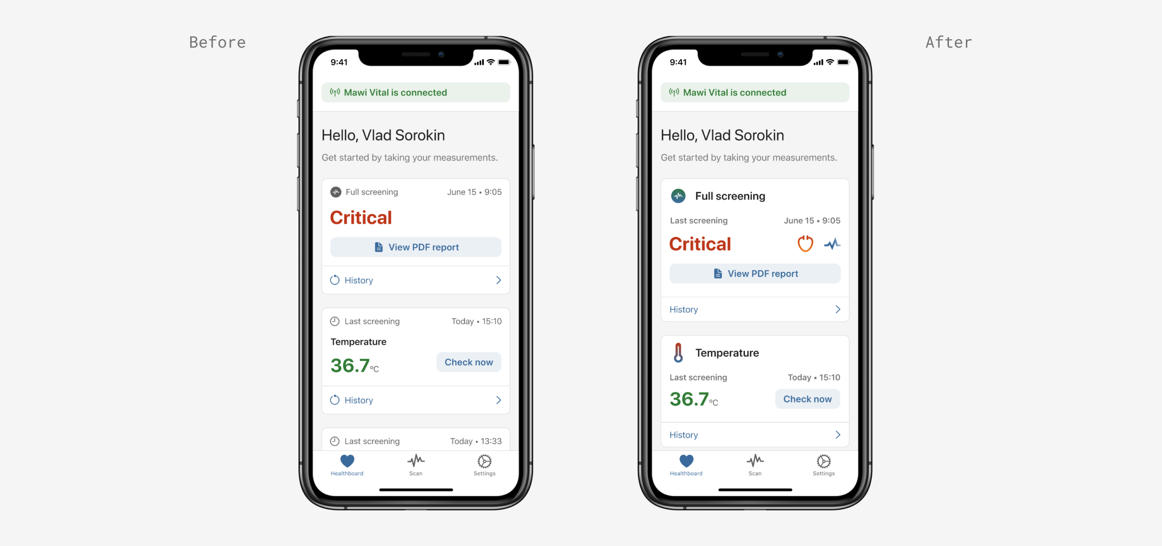
First iteration of the Healthboard
Healthboard. Second iteration.
Next iteration was based on maintaining localization for different markets. We were aiming to launch the app in English, Ukrainian, Italian, Russian, and Kazakh languages.
Because of this language update, I had to redesign a card layout for measurements. So I aligned everything to the left side giving more safe space for various languages and their wording specifics.
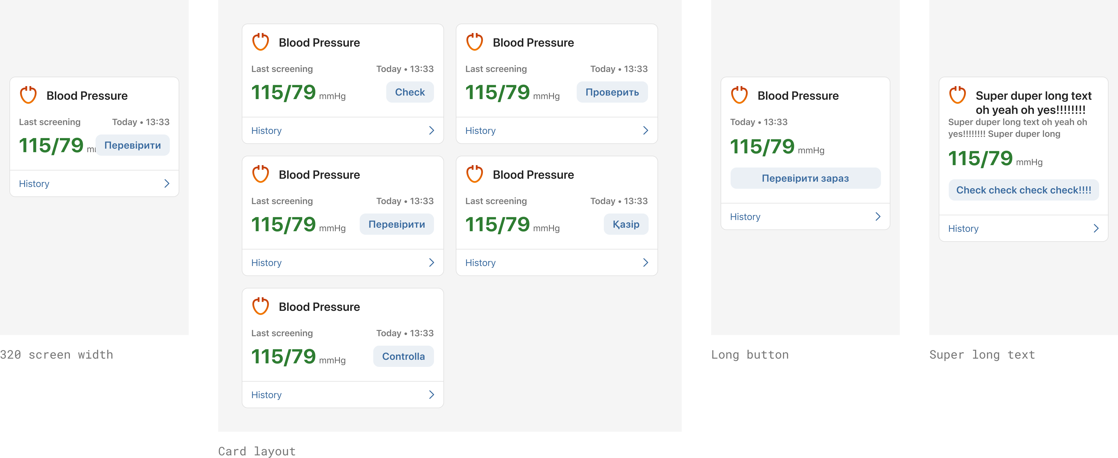
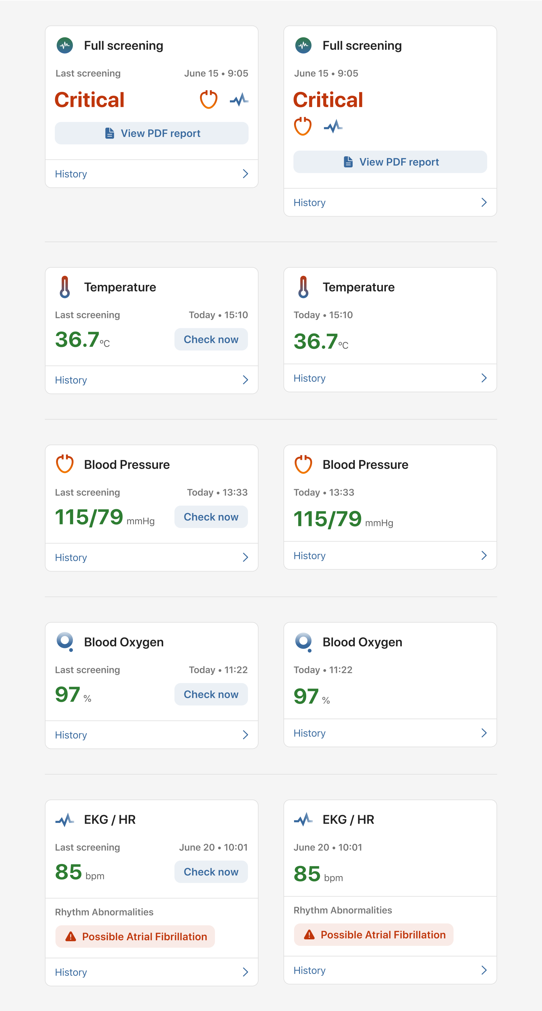
Health cards. Second iteration. Before and after.
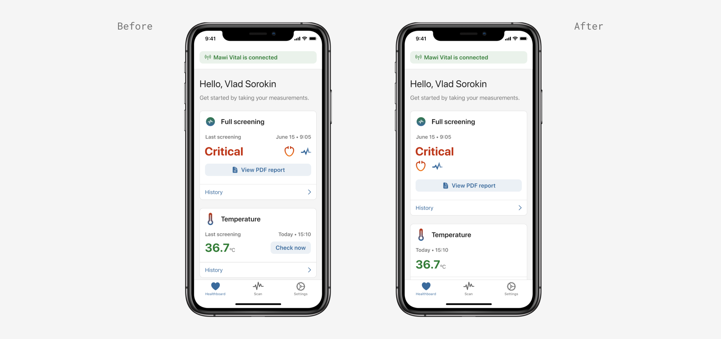
Second iteration of the Healthboard
Healthboard. Third iteration.
Throughout the whole day, users had to take a specific number of measurements. So we developed a “Weekly progress” feature having people informed about their progress.
User value — increase people's engagement for prevention, self-management of chronic conditions, and keeping up with health records and goals.
Business value — completion rate would increase the percentage for providing vital information in an emergency + improving communication with doctors when needed.
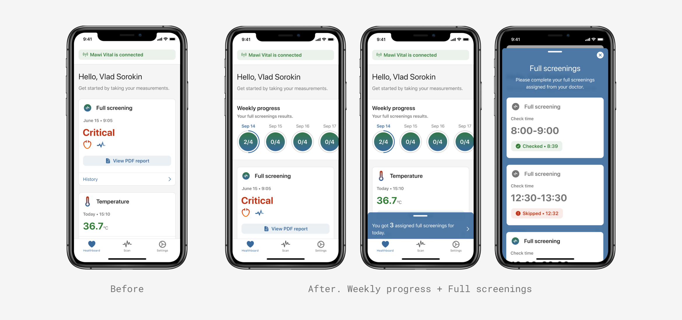
Third iteration of the Healthboard
Conducting usability testing.
I conducted usability testing with 10+ participants to test the design of our Healthboard + run through the main user scenarios as well.
User tasks:
- Connect a device
- Check temperature
- Check blood oxygen
- Check blood pressure
- Check EKG
- Unpair device (optional)
- Share your latest scan
User scenarios:
- You recently had your birthday on which you received a Mawi Vital device as a present from your family. Connect Mawi Vital to your app.
- For a regular evening check up, you usually measure your body temperature. Take a measurement of your body temperature.
- For a regular evening check up, you usually measure your blood oxygen. Take a measurement of your blood oxygen.
- For a regular evening check up, you usually measure your blood pressure. Take a measurement of your blood pressure.
- For a regular evening check up, you usually measure your EKG. Take a measurement of EKG.
- You no longer need a Mawi Vital device, because you’re not planning to use it anymore. Unpair your Mawi Vital device from the app.
- Your doctor just told you that you need to share your latest EKG scan. Share your latest EKG scan with the doctor.
Results
After the usability testing, main issues were noticed:
- The main scan button is not obvious enough
- Sharing reports takes a lot of time, because participants don't find the Share Report button
- Device connection status feels like it’s tappable. By tapping it participants expect to disconnect a device.
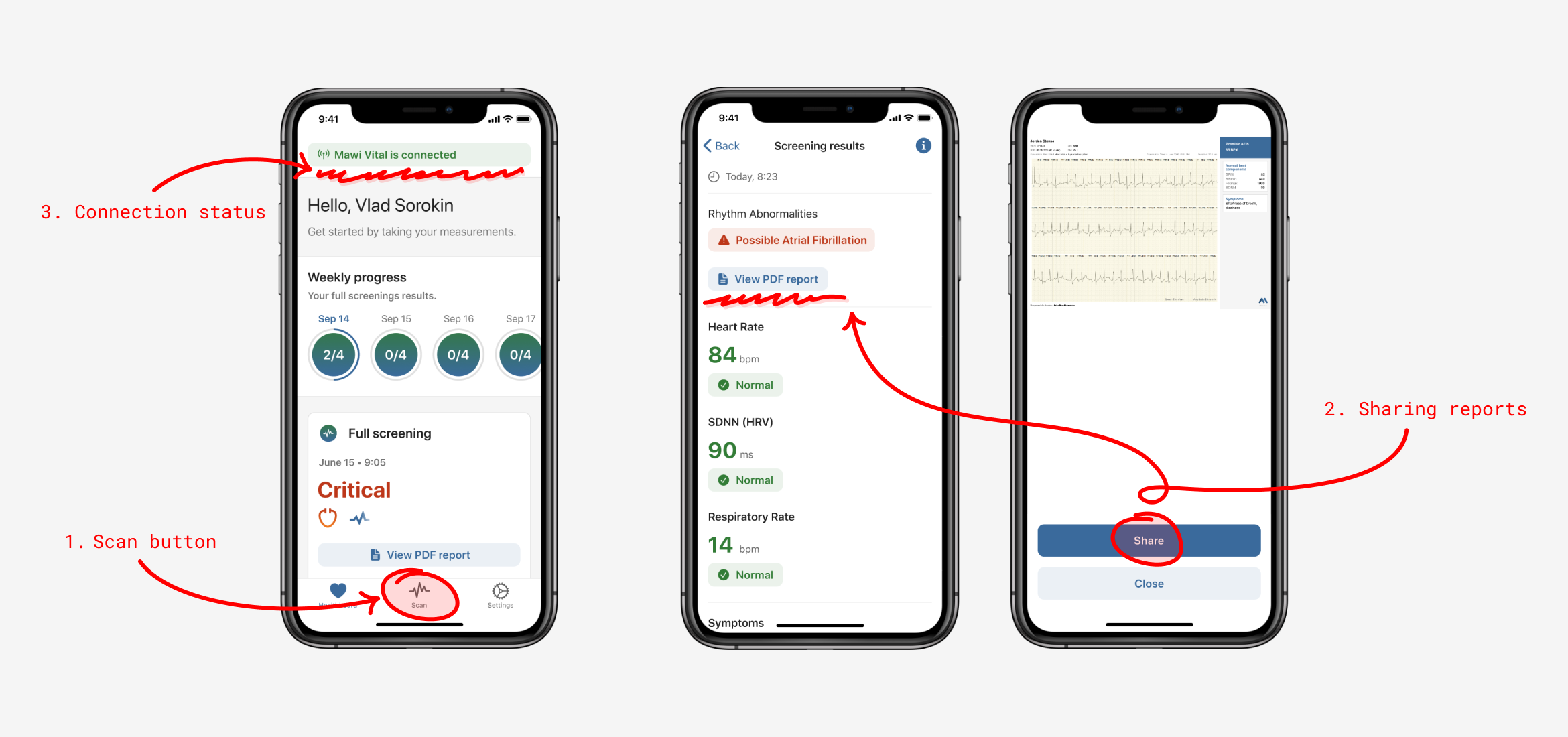
Reviewing usability testing results
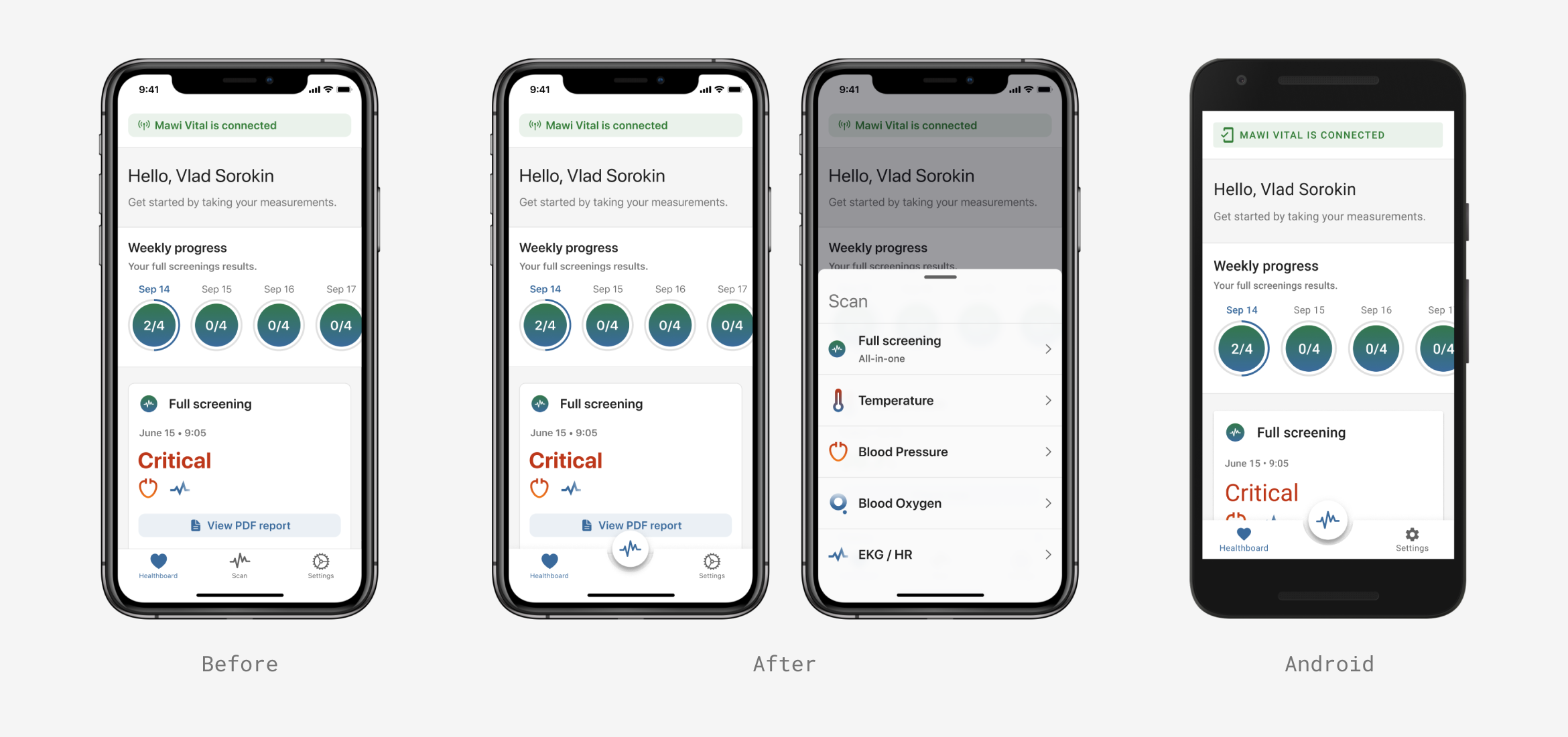
1. The main scan button
Even though the button was put in the tab bar, it was lacking visual clue. The reasons we didn’t design it properly were:
- It would require a lot engineering lift to implement it
- We had other priorities at that time.
My main reference was to design the scan button for iOS similar to the Android one that I worked on just to keep it consistent for both platforms.
Scan button update
2. Share reports.
The initial flow for sharing a report required 3 taps, and it was quite hidden. Participants wanted to share the latest report quickly when it had possible health warnings.
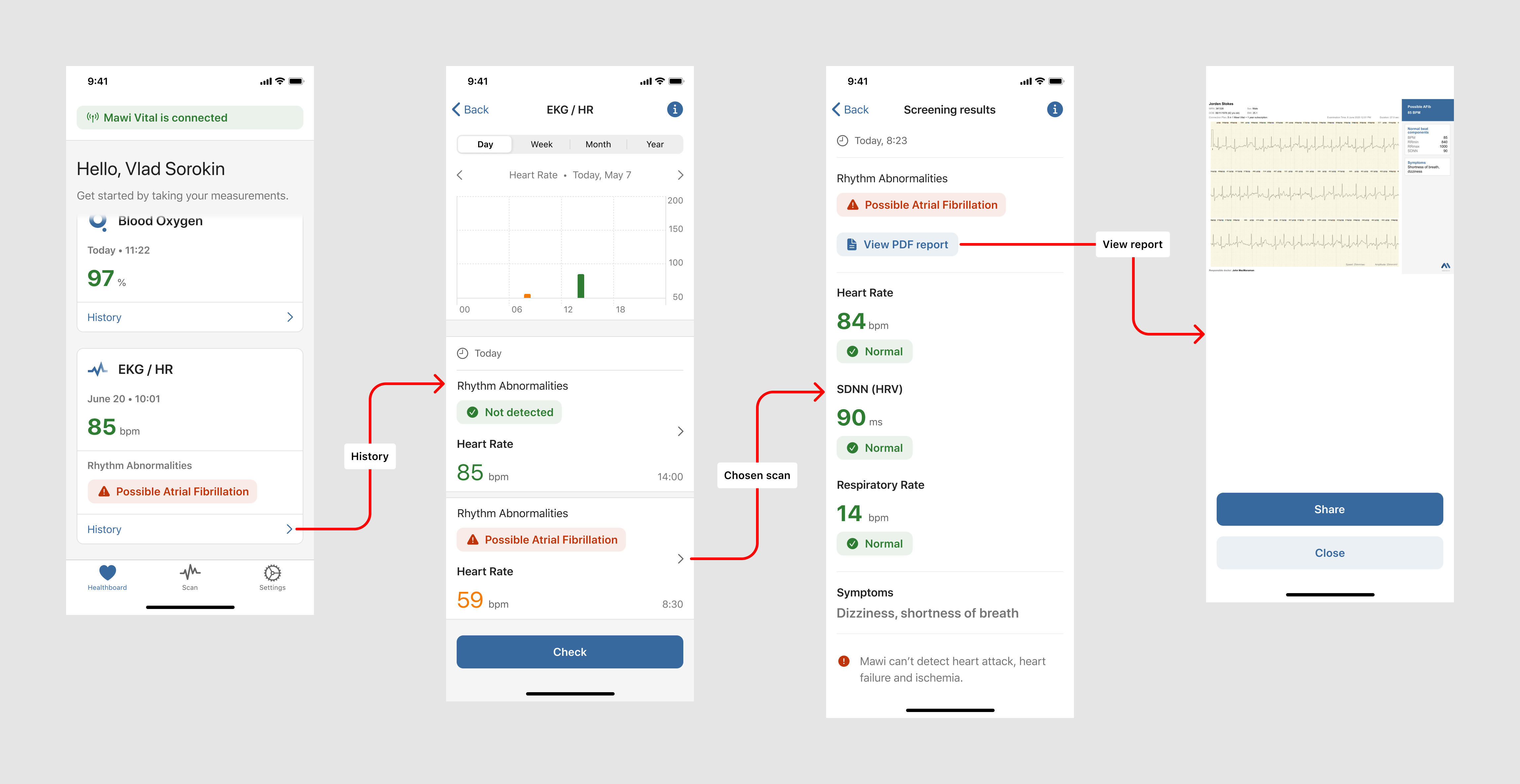
Sharing a report. Current user flow
In order to reduce the number of taps, and make reports available for instant sharing, I added an icon that would lead people to the desired report which they could share with doctors or family.
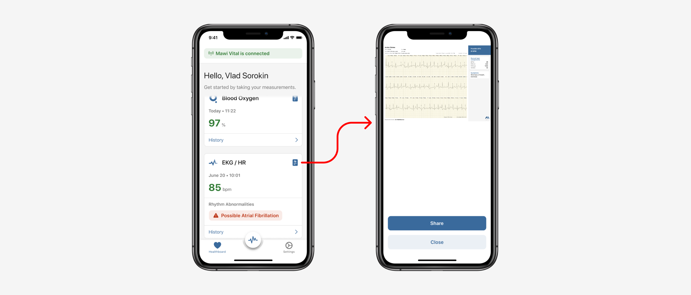
Sharing a report. New user flow
3. Connection status
To maximize the perceived affordance of clickability (tappability), I added an icon (chevron) in the connection status, so people could understand that this element is interactive and it provides needed functionality. A flow for managing connected devices was also designed.
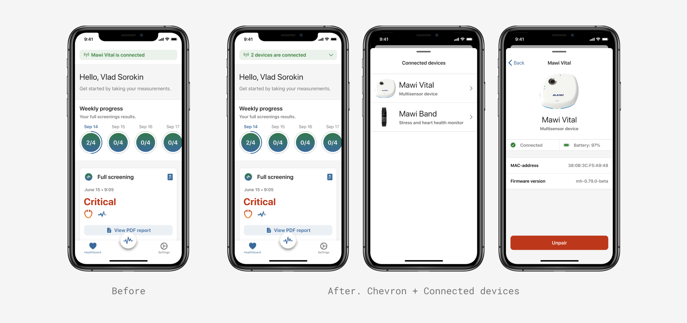
Connection status update
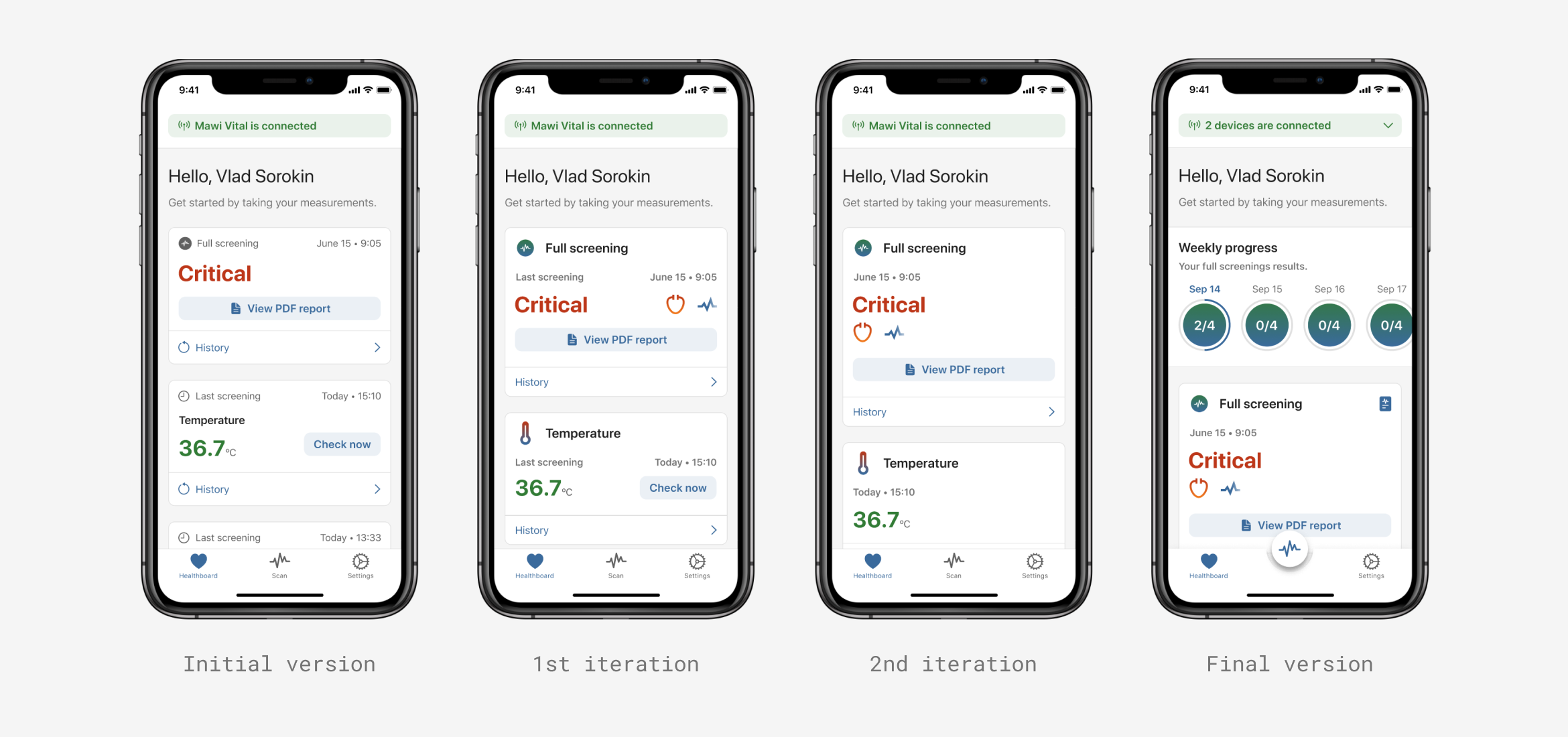
Healthboard's evolution
?? What I have learned
Design iterations and having these iterations measured is a critical part of the design process and the strategy of a product. Even though it requires some time and resources, the end result is definitely worth both for the product and for the end users.
By conducting the usability testing, important gaps in the main user scenarios were filled in with needed design improvements. As a result, the user success rate improved by 80% (9 of 11 user scenarios succeeded).
- 100% of participants noticed the new scan button and successfully completed desired measurements
- Sharing reports increased by 90%
- 80% of participants understood how to use the connection status