Getting started
Getting Started
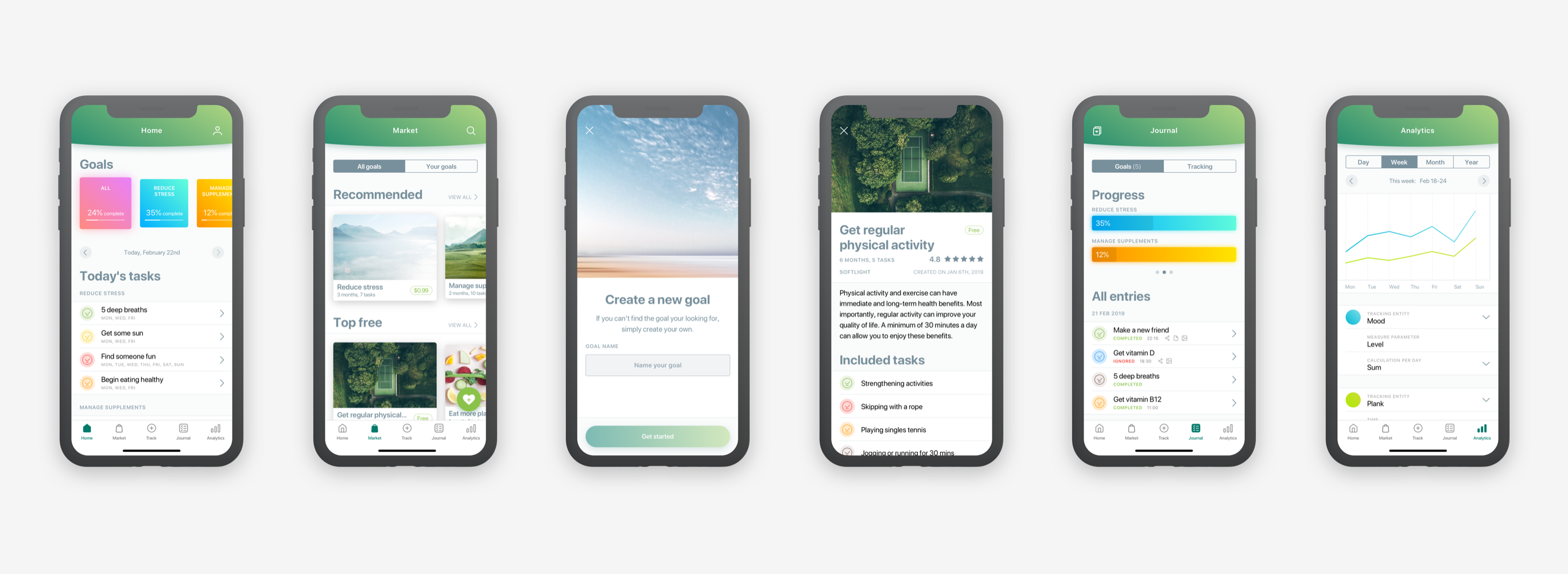
HealthCraft is a platform that helps people to improve their health by tracking various health changes, and analyzing those changes through the analytics section. Every possible health change is being kept in the journal, and can be used as a history snapshot for improving users’ well-being.
I was fully responsible for delivering UX, UI and other visual design work for the whole platform which consisted of an iOS app, an android app, and two web admin panels. Tightly worked in a cross-functional team where was producing design documentation required for implementation with the engineering team.
Joined the team when the ideation stage was already completed, but it needed to be adjusted to a new business model back then. The product and its business module were changing rapidly, so I got to be sure I was moving fast and confidently with my design decisions, so the development process would be on time as planned.
HealthCraft is a platform that helps people to improve their health by tracking various health changes, and analyzing those changes through the analytics section. Every possible health change is being kept in the journal, and can be used as a history snapshot for improving
users’ well-being.
I was fully responsible for delivering UX, UI and other visual design work for the whole platform which consisted of an iOS app, an android app, and two web admin panels. Tightly worked in a cross-functional team where was producing design documentation required for implementation with the engineering team.
Joined the team when the ideation stage was already completed, but it needed to be adjusted to a new business model back then. The product and its business module were changing rapidly, so I got to be sure I was moving fast and confidently with my design decisions, so the development process would be on time as planned.
HealthCraft is a platform that helps people to improve their health by tracking various health changes, and analyzing those changes through the analytics section. Every possible health change is being kept in the journal, and can be used as a history snapshot for improving users’ well-being.
I was fully responsible for delivering UX, UI and other visual design work for the whole platform which consisted of an iOS app, an android app, and two web admin panels. Tightly worked in a cross-functional team where was producing design documentation required for implementation with the engineering team.
Joined the team when the ideation stage was already completed, but it needed to be adjusted to a new business model back then. The product and its business module were changing rapidly, so I got to be sure I was moving fast and confidently with my design decisions, so the development process would be on time as planned.
Users
What problem are we trying to solve?
What problems are users facing?
Since medical science has been developing rapidly, it’s getting more convenient and efficient to use technology as a primary assistant for maintaining our daily lives. People used to write a lot of notes regarding their treatment schedule on a piece of paper. As a result, a lot of notes are being lost, making doctors and patients communicate inefficiently. Crucial information is being wasted, and our lives are becoming much
more complicated.
Possible solutions to solve such a problem:
What problem are we trying to solve?
What problems are users facing?
Since medical science has been developing rapidly, it’s getting more convenient and efficient to use technology as a primary assistant for maintaining our daily lives. People used to write a lot of notes regarding their treatment schedule on a piece of paper. As a result, a lot of notes are being lost, making doctors and patients communicate inefficiently. Crucial information is being wasted, and our lives are becoming much more complicated.
Possible solutions to solve such a problem:
What problem are we trying
to solve?
What problems are users facing?
Since medical science has been developing rapidly, it’s getting more convenient and efficient to use technology as a primary assistant for maintaining our daily lives. People used to write a lot of notes regarding their treatment schedule on a piece of paper. As a result, a lot of notes are being lost, making doctors and patients communicate inefficiently. Crucial information is being wasted, and our lives are becoming much more complicated.
Possible solutions to solve such a problem:
- Track every possible health change, and having it saved safely in the app
- To be confident that the stored information can be shared seamlessly with doctors and hospitals
- Based on tracked data, analytics could provide insights about possible upcoming health risks
Research
Are we designing the right thing? Do users really want/need this?
To answer these questions the team hired a freelance researcher who provided in-depth research about our potential user base, their engagement with mobile devices and health app use.
I went through the research document, and filtered out the key points which helped me to build a broader image about our user base, their possible motives of using health apps, and other related details which could help me to develop my design solutions.
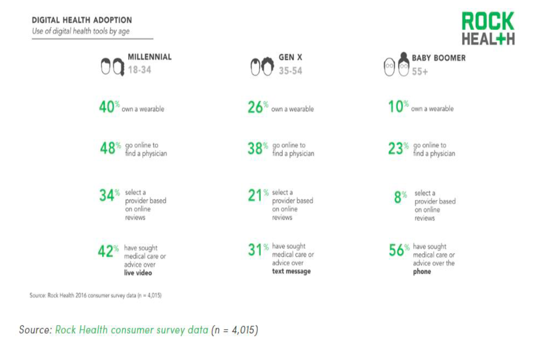
A part from the research
Here is what I learned from the research:
Main users of health apps are:
◦ Young and educated people
◦ Having excellent health and higher incomeApp use was associated with intentions to change diet and physical activity and meeting physical activity recommendations
Usage of mHealth is highest amongst the 25-34 age bracket across all mediums, followed by the 35-44 age bracket. Baby Boomers (55+) are the least likely age group to have used telemedicine, although more than half have sought virtual medical care with a provider through a live telephone call
82% under 55 trust their physician and 35% trust a technology company with their health information
The most popular method for baby boomers to track health across all categories is in their head; but for those who do use an app, 25% are tracking physical activity, 17% are tracking sleep, and 10% are tracking heart rate
Main users of health apps are:
• Young and educated people
• Having excellent health and
higher incomeApp use was associated with intentions to change diet and physical
activity and meeting physical
activity recommendationsUsage of mHealth is highest amongst the 25-34 age bracket across all mediums, followed by the 35-44 age bracket. Baby Boomers (55+) are the least likely age group to have used telemedicine, although more than half have sought virtual medical care with a provider through a live telephone call
82% under 55 trust their physician and 35% trust a technology company with their health information
The most popular method for baby boomers to track health across all categories is in their head; but for those who do use an app, 25% are tracking physical activity, 17% are tracking sleep, and 10% are tracking heart rate
Analyze
Based on this research, I created a persona which could help me to define users’ problems and needs, and also illustrate behavioral and attitudinal details. In addition to the persona, I came up with an empathy map to create storytelling and visualization and build possible empathy with our end users.
The main reasons I used these mapping methods were:
- Remove bias from my designs and put the team on the same page for understanding our users
- Discover possible gaps in our research
- Understand what drives users’ behaviors and why
- Come up with innovative solutions if possible
- Remove bias from my designs and put the team on the same page for understanding our users
- Discover possible gaps in our research
- Understand what drives users’ behaviors and why
- Come up with innovative solutions
if possible
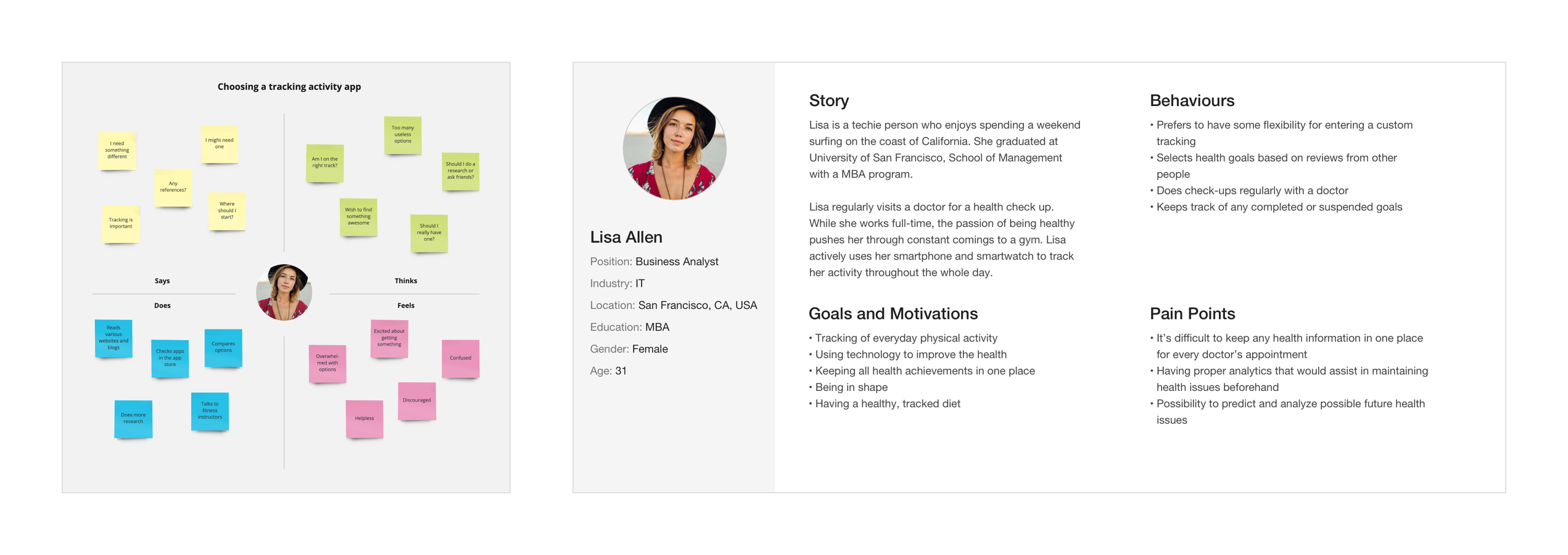
Empathy map + persona
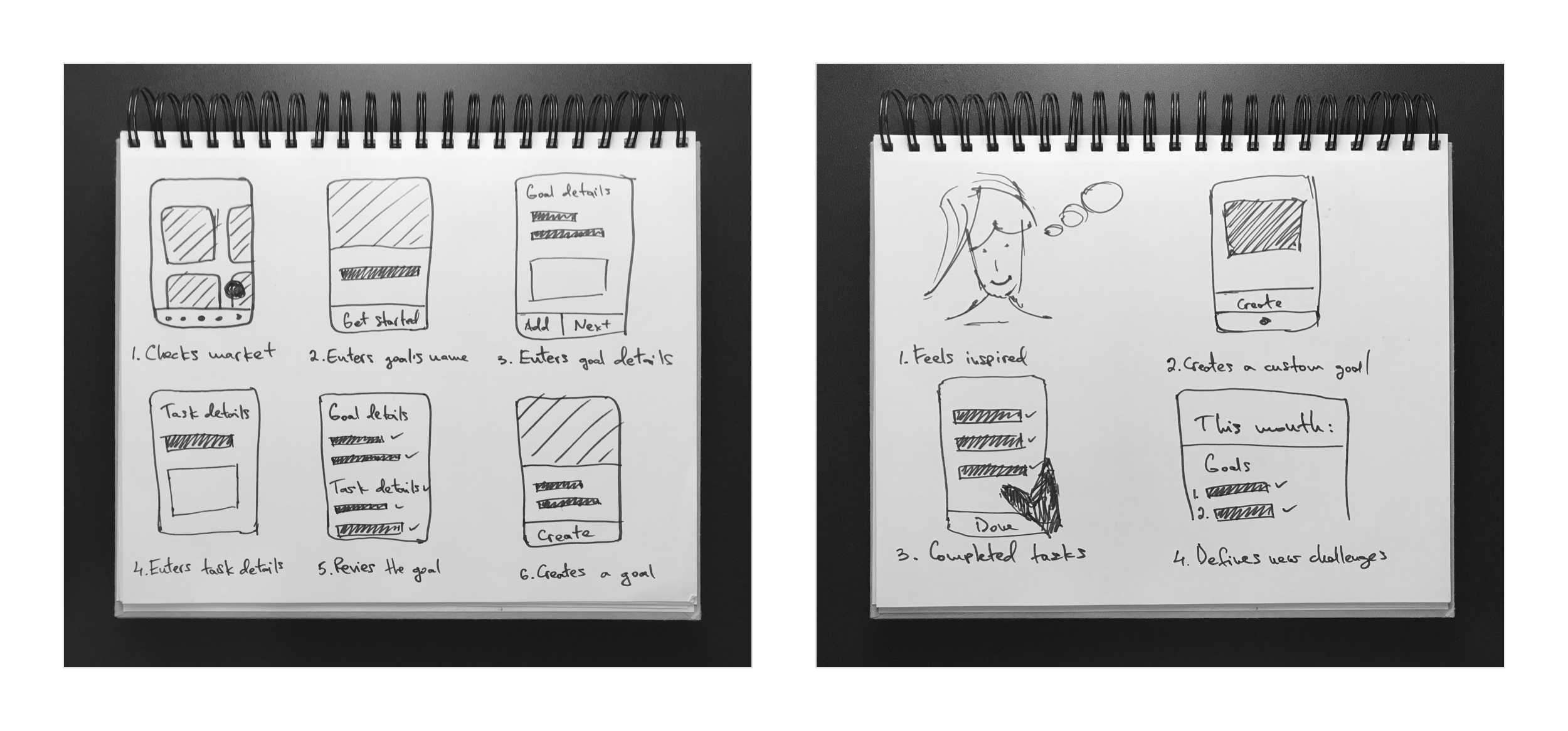
Storyboarding
Design
Once we established a broader picture about our users, their needs and possible behaviours, I was ready to move forward to crafting the actual product.
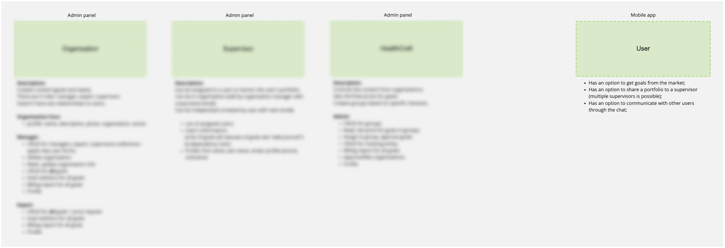
Information architecture: 4-system relationship
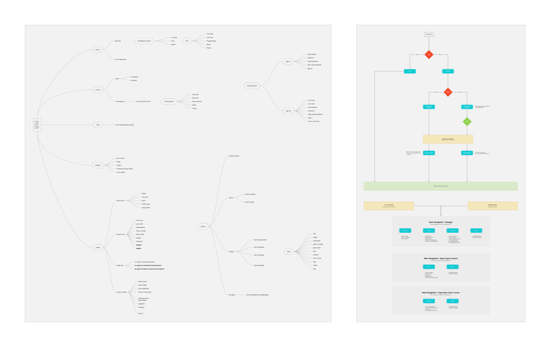
Mind mapping and user flow
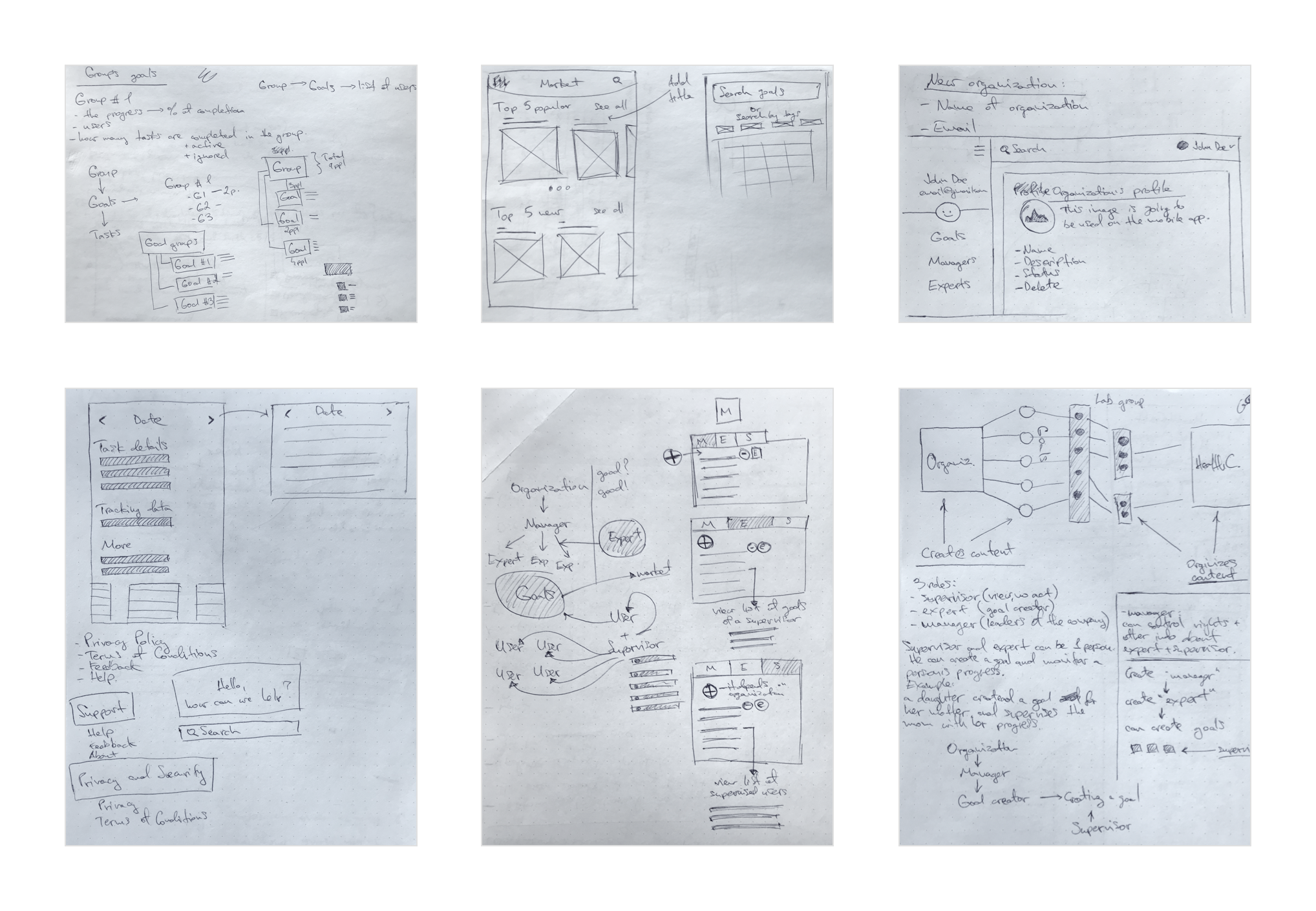
Sketching, wireframing, brainstorming
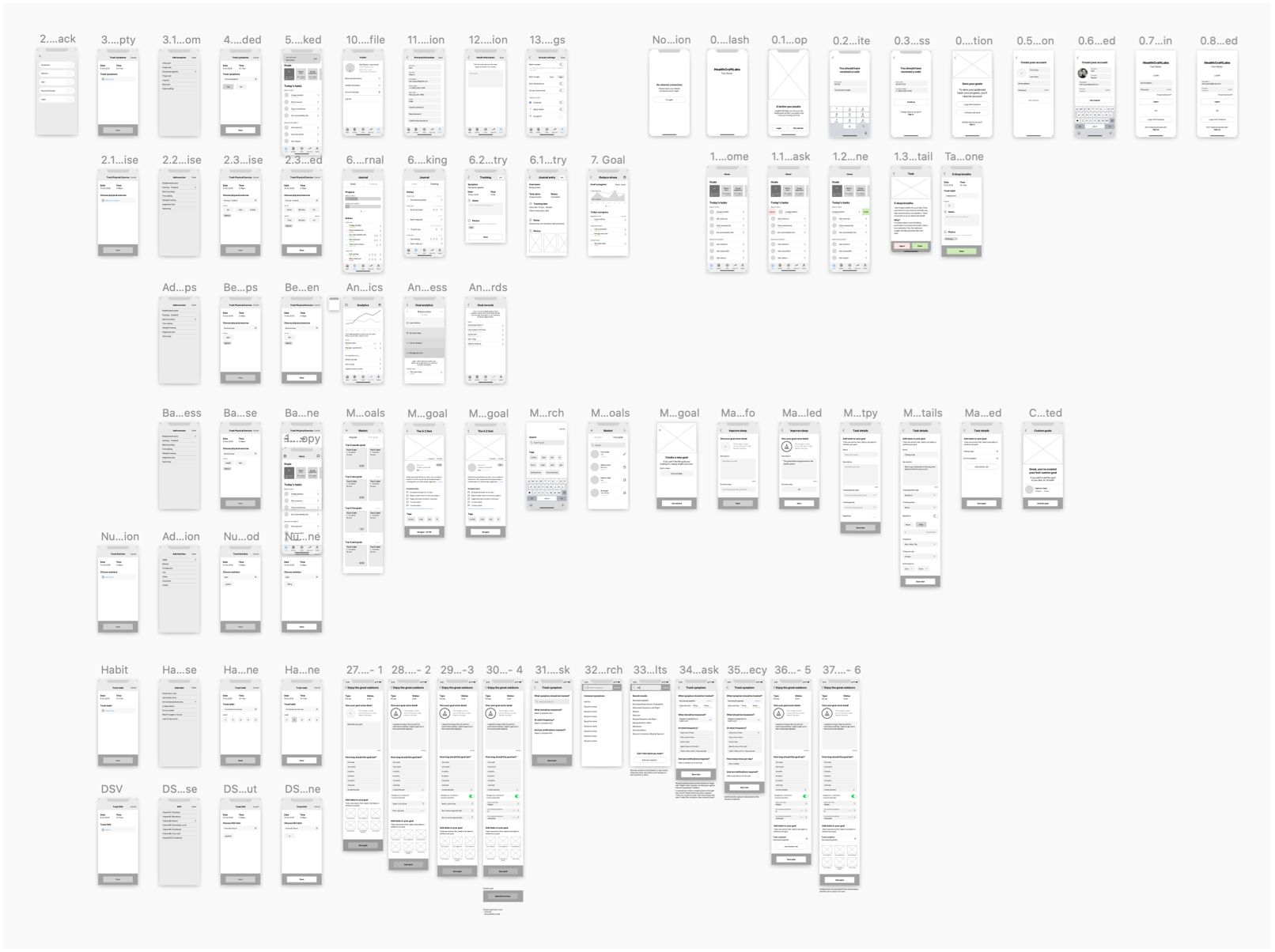
High-fidelity wireframes: mobile app (iOS)
High-fidelity wireframes: mobile
app (iOS)
Design (iOS)
Design, redesign, scrap it, and design it all over again — good times!
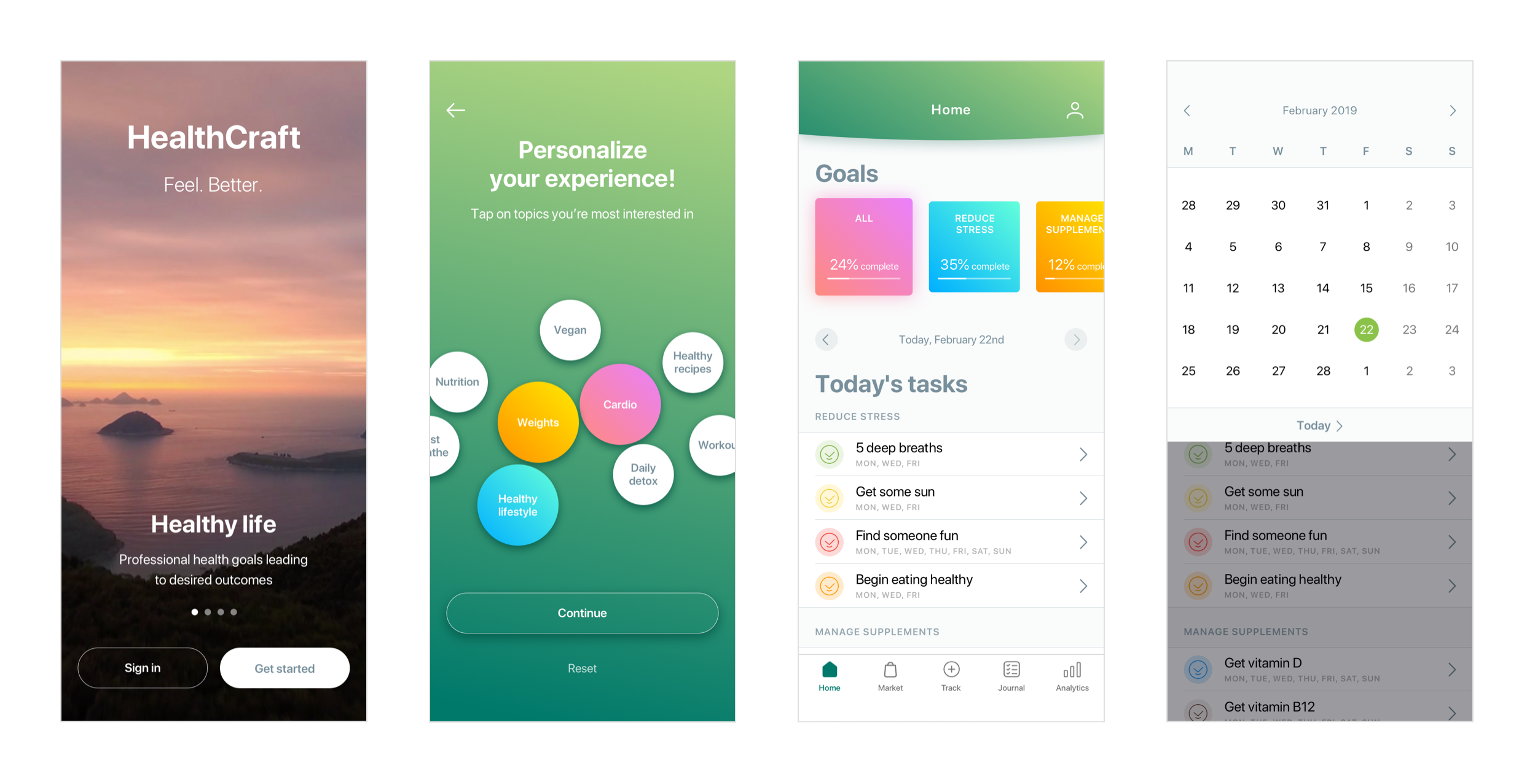
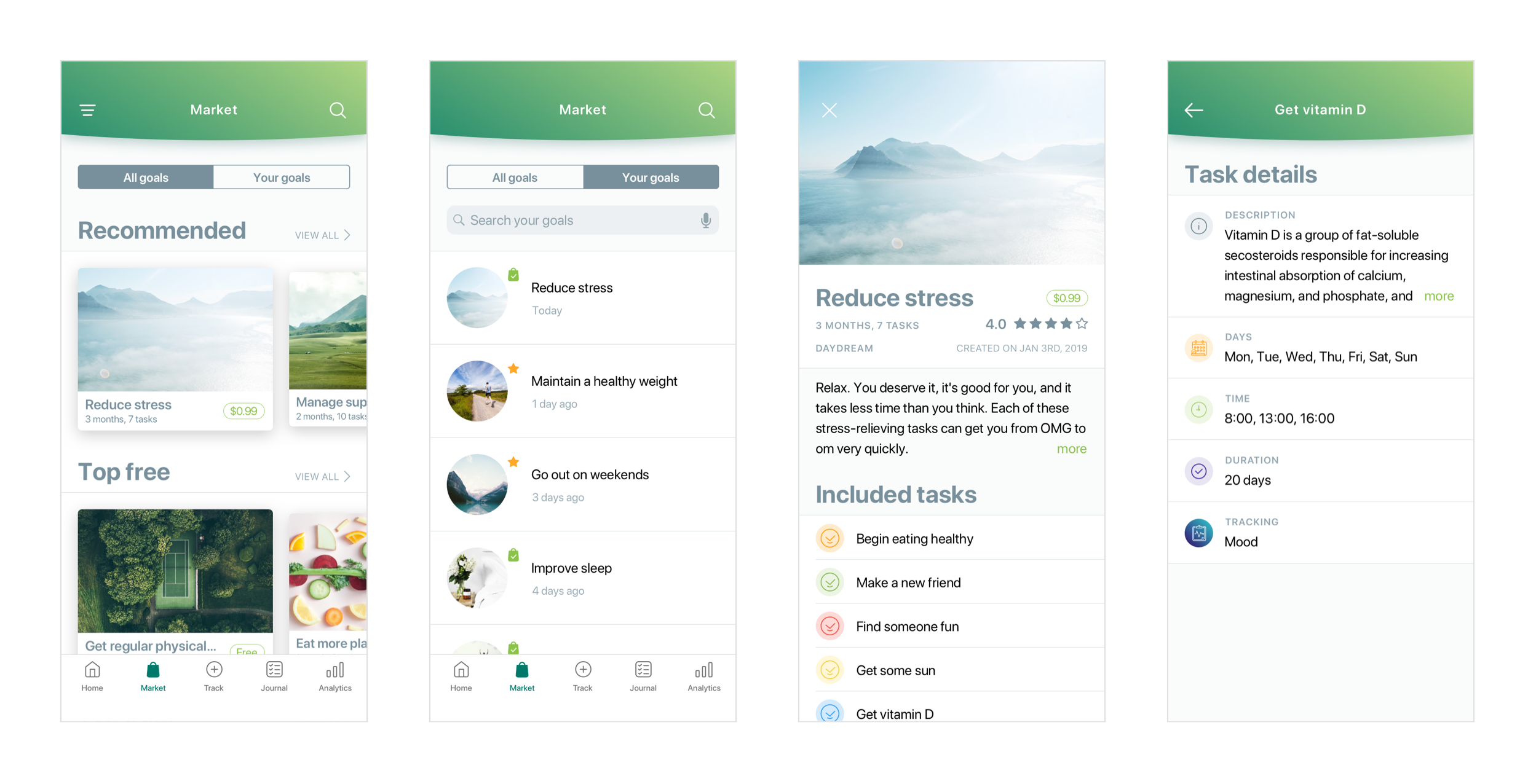
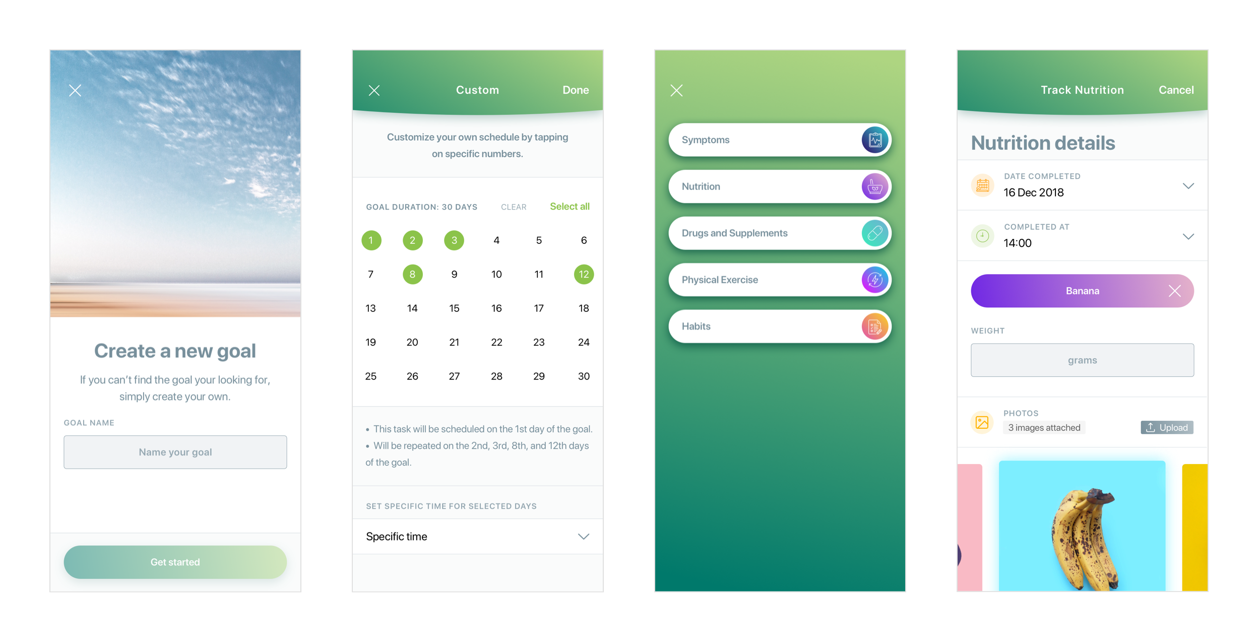
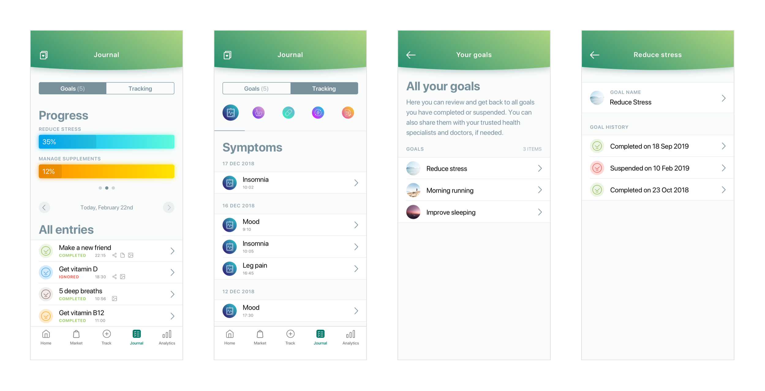
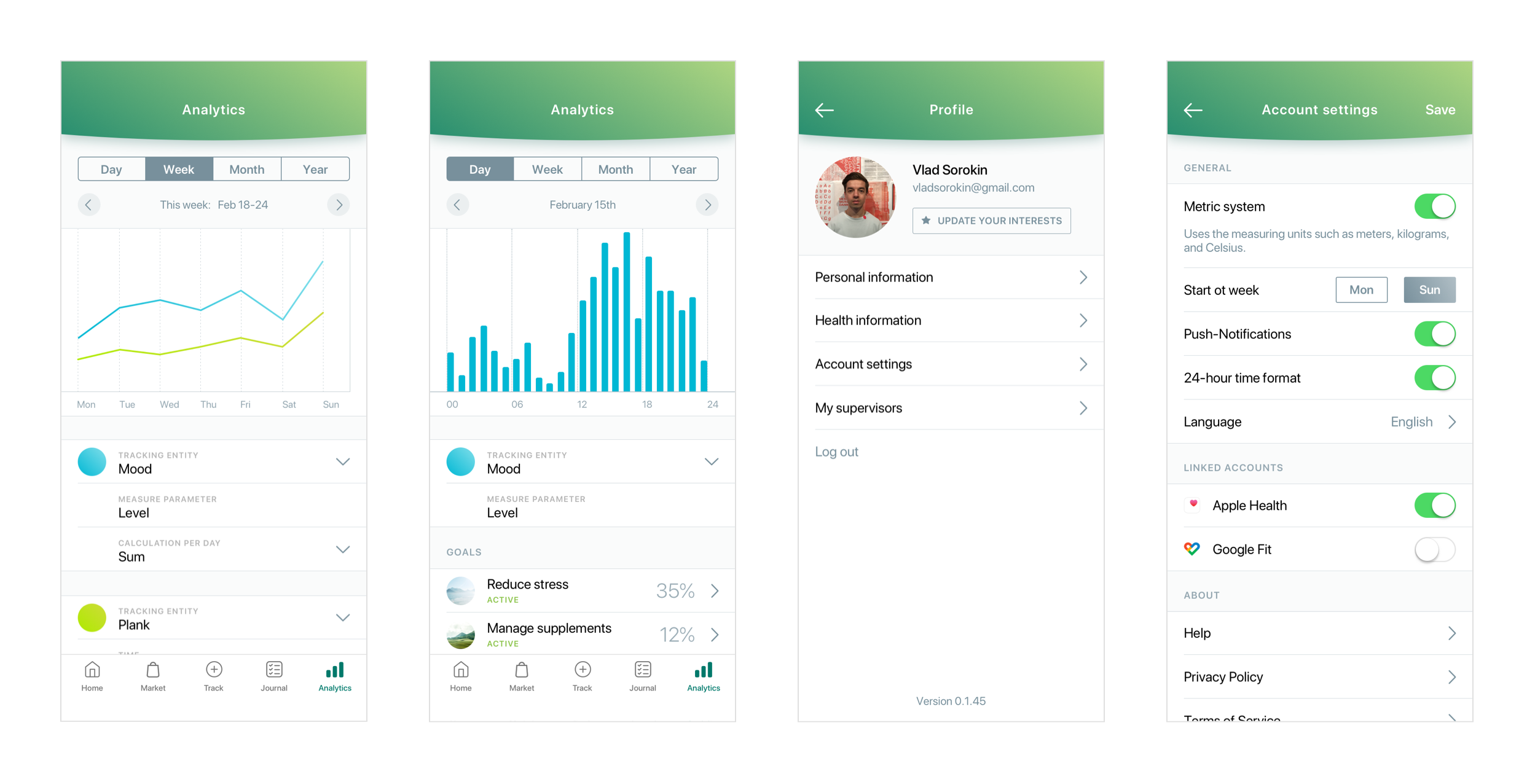
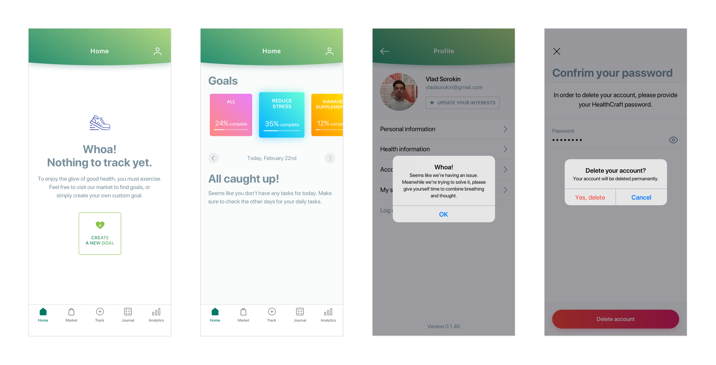
Design mockups
Launch
At this stage I was super closely communicating with the dev team, providing design specs, and reviewing the production version after QA testing was completed. The app was used internally by the team throughout the development stage, so we could be in our users’ shoes and see if we missed something important out there.
Even though we were quite familiar with our app and its features, I received a lot of great feedback about improving the overall design of the product:
- Some icons were not enough intuitive, so I had to redesign them
- The goals’ history flow was a bit complicated, so I need to come up with the idea of how to simplify it so it would take less steps to complete a task
- Received suggestions about copywriting and naming of some buttons
- Some icons were not enough intuitive, so I had to redesign them
- The goals’ history flow was a bit complicated, so I need to come up with the idea of how to simplify it so it would take less steps to complete
a task - Received suggestions about copywriting and naming of some buttons
During the launch time I also prepared such
marketing assets:
During the launch time I also prepared such marketing assets:
During the launch time I also prepared such marketing assets:
- Responsive landing
- Assets for a Facebook campaign: carousel and images
- App previews and screenshots for the App store
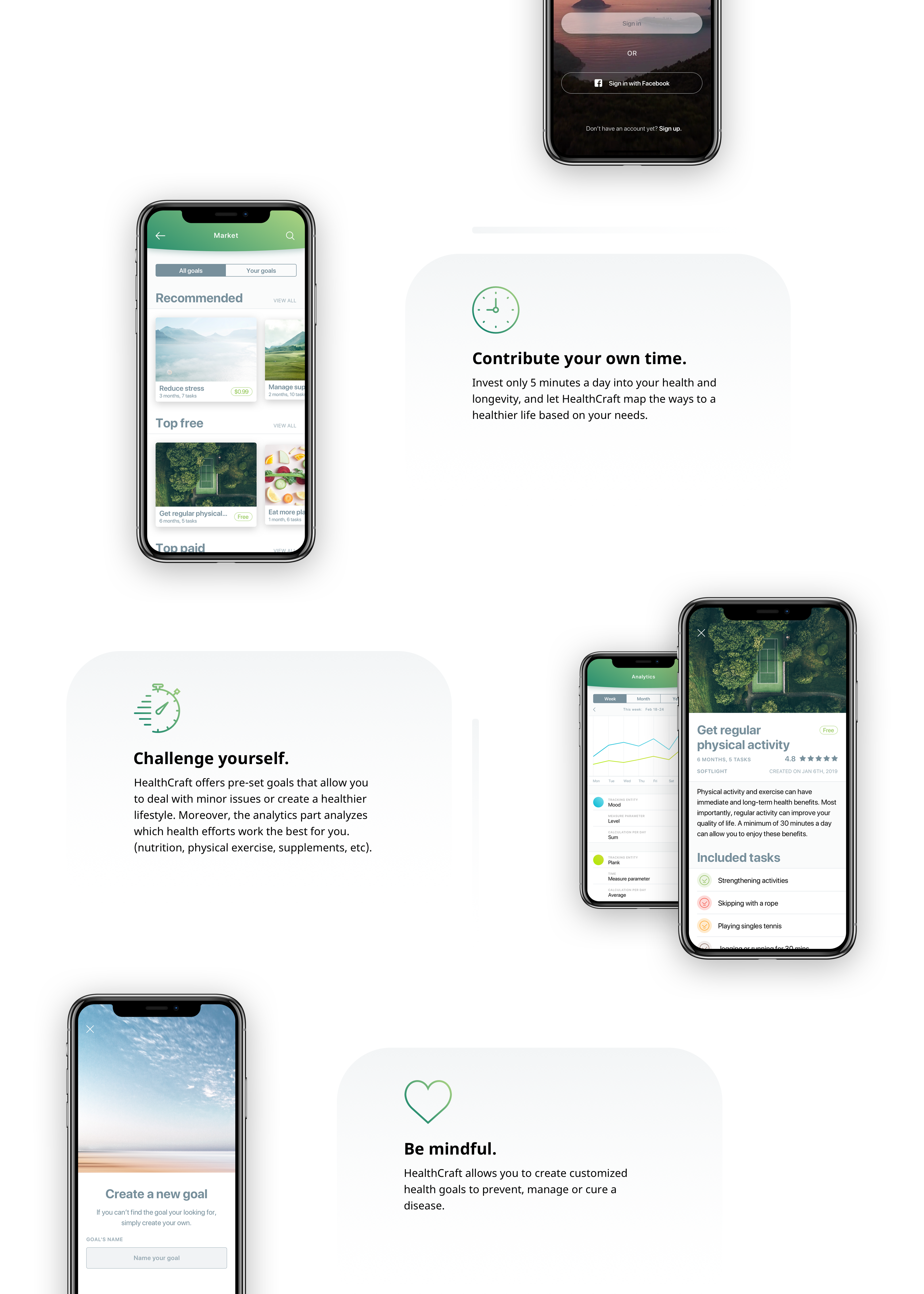
Landing
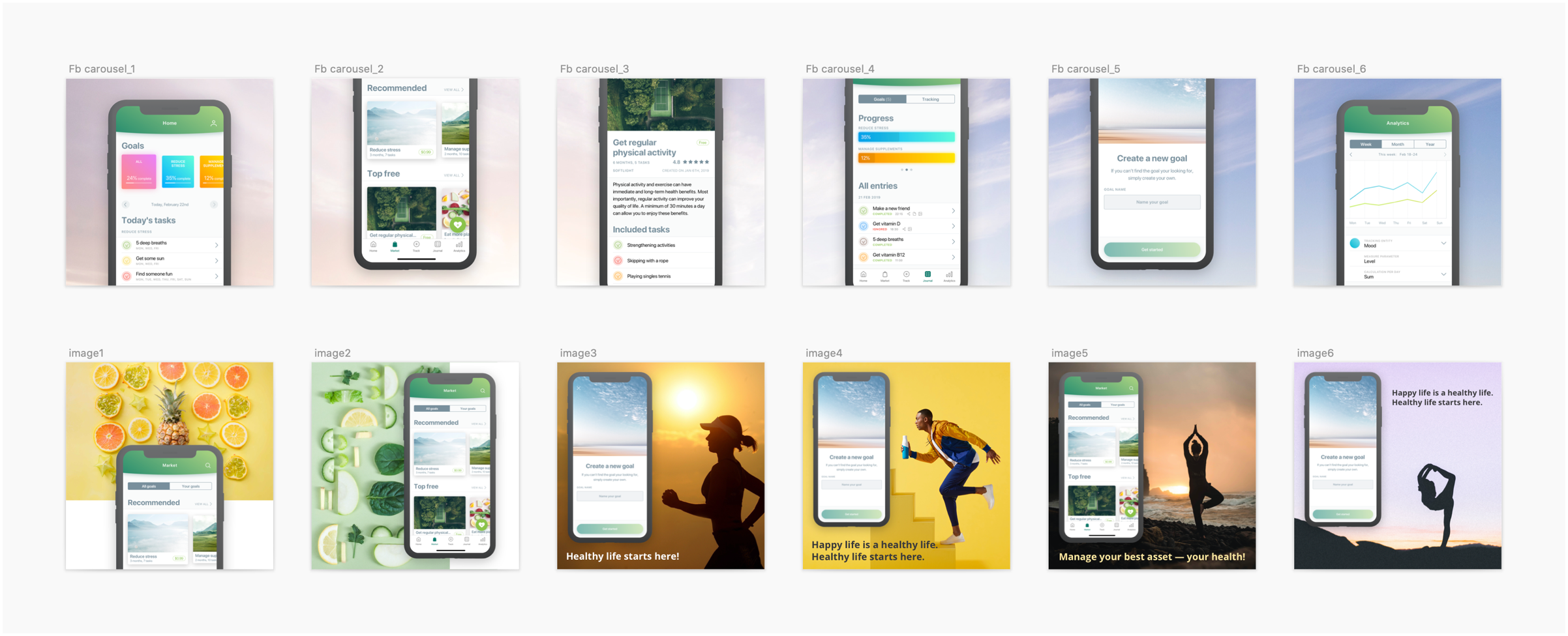
Assets for a Facebook campaign

App previews and screenshots
?? What I have learned
Working on crafting two different platforms, web and mobile, provided me priceless experience in self-organizing my design flow. Day-to-day responsibilites required a lot of attention in communicating with
the team members who were responsible for
different platforms.
I learned how to work effectively and efficiently in such a hectic atmosphere. I got to be sure the flow we discussed within the team was consistent through all platforms. The mobile apps and two web admin panels were closely related by the flow and design consistency. One possible issue in the consistency could cause a domino effect which would end up by a failure of the whole system.
Being responsible for the multiple platforms, I learned how to successfully keep the team on the same page regarding the design, and provide required design outcomes for a specific platform accordingly.
Working on crafting two different platforms, web and mobile, provided me priceless experience in self-organizing my design flow. Day-to-day responsibilites required a lot of attention in communicating withthe team members who were responsible for different platforms.
I learned how to work effectively and efficiently in such a hectic atmosphere. I got to be sure the flow we discussed within the team was consistent through all platforms. The mobile apps and two web admin panels were closely related by the flow and design consistency. One possible issue in the consistency could cause a domino effect which would end up by a failure of the whole system.
Being responsible for the multiple platforms, I learned how to successfully keep the team on the same page regarding the design, and provide required
design outcomes for a specific
platform accordingly.
Working on crafting two different platforms, web and mobile, provided me priceless experience in self-organizing my design flow. Day-to-day responsibilites required a lot of attention in communicating with the team members who were responsible fordifferent platforms.
I learned how to work effectively and efficiently in such a hectic atmosphere. I got to be sure the flow we discussed within the team was consistent through all platforms. The mobile apps and two web admin panels were closely related by the flow and design consistency. One possible issue in the consistency could cause a domino effect which would end up by a failure of the whole system.
Being responsible for the multiple platforms, I learned how to successfully keep the team on the same page regarding the design, and provide required design outcomes for a specific platform accordingly.